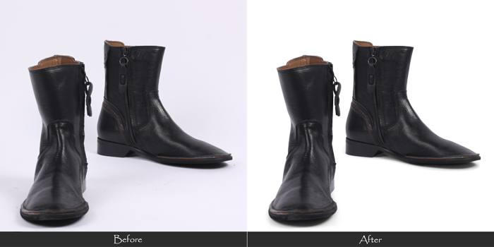
If you are an online buyer, you will know the importance of the product images and the effect they have on your purchase. If the image looks dull, your mind automatically tells you to look for another one. If you find the image hazy or blurred, then you certainly wouldn’t select that product, because you don’t trust its image. Whatever the defect, your mind judges the quality of the product based on the image. When you know all this, why take a risk? To develop an online shopping portal, the main rules that every product image must adhere to are:
1. Clarity: Your image shouldn’t be too blurred and hazy because that wouldn’t show proper details.
2. Color propriety: Your image must look the color it actually is! Inappropriate lighting gives off the wrong image to the buyer.
3. Spot-free image: Blemishes in your image might give the opinion that your product has defects.
4. Sufficient lighting: If your product isn’t shown in good lighting, it looks dull and doesn’t attract customers.
5. Effective background: Your product image should go with plain (preferably white) backgrounds which aren’t too distracting.
6. Abundance of images covering every angle (or a 360 degree view): Usually one image isn’t enough for the customer to make up his/her mind.
7. Image consistency: All the images must be cropped in the same size with the same shadow effects and same background, to avoid confusion.
Make sure your image satisfies all the above criteria, and then upload it.
